

Beaches are adapted for the whole family only in the Wave Splash
Fun, speed and customization for you.


Enjoyment

Quickness

Customization
Quickness

Brand Values

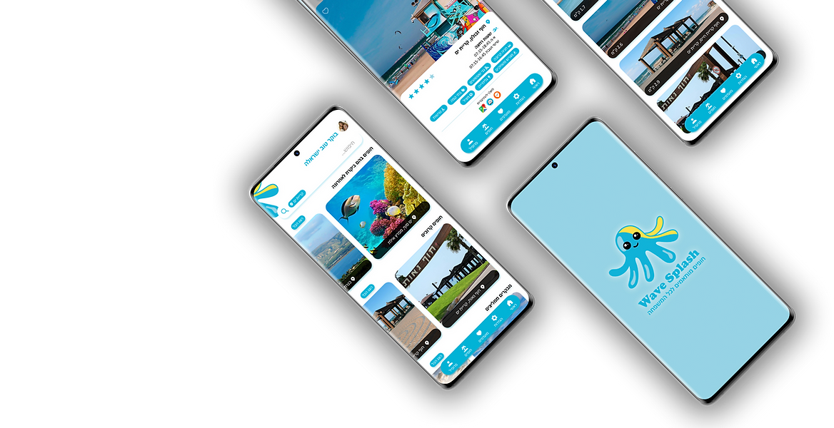
BRANDING & LOGO
Figurative language. Suitable for children but also mature for parents. Preparing the brand for further design. Inspiration was taken from
the children's world, a children's emotion doll.
The octopus represents the brand's values -
Enjoyment, speed and customization (flexibility).
CONCEPT
The concept is joy.
AUDIENCE
The branding for the app is intended for parents who want to find a suitable beach for them easily and quickly.
COLORS
Light blue and yellow.
A combination that represents joy and speed, lightness and customization for the target audience
which is Israeli.

01
#10B1D7
02
#97D4E6
03
#FAE04B
UI & UX DESIGN
Selected screens

Splash screen

Home page

Showing results

Closer Beaches Inside


Full Home Page

DIGITAL
The app launch button

![767d5fce-767d-4c99-8083-4209aa343af7 [Converted]-03.png](https://static.wixstatic.com/media/47611d_49b5b50d05b749dfbb79623d65a9a698~mv2.png/v1/fill/w_143,h_143,al_c,q_85,usm_0.66_1.00_0.01,enc_avif,quality_auto/767d5fce-767d-4c99-8083-4209aa343af7%20%5BConverted%5D-03.png)